Overview
Gnarles here. Let's talk about the worst part of the job.
It's not the cutting. It's the part where the cut is good enough to show somebody and you have to figure out how to put it in front of them.
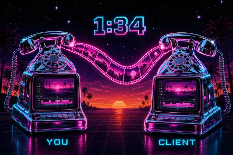
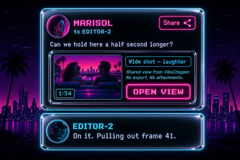
You used to export a watermarked MP4. Three minutes of render. Drop in Dropbox. Paste a link in Slack. Wait for them to open it on the bad couch laptop with the buzzing speaker. Then they message back: "yeah looks great except the part around like 1:34?"
Around 1:34. Around. Around.
You scrub to 1:34. To 1:33. To 1:36. Nothing wrong at any of those. You ask: "what specifically?" Forty minutes later: "oh sorry I meant 1:24 lol." You scrub to 1:24, see the cut, fix it in twelve seconds, re-render, re-upload, re-paste, wait.
We built a button for this. The cut never left the app. The render never ran. The "around 1:34" never happened.
1. The "look at 1:34" problem
"Look at 1:34" failed because the timecode was the only thing the medium could carry.
What you actually wanted to send was a frame, the clip that frame belonged to, the timeline state — playhead, selection, panel — and the thought you had when you paused. You wanted your client to receive that in the same room you were standing in.
Email couldn't carry the room. Slack couldn't either. Loom carried a video of the room, but the room wasn't openable. Frame.io carried the room — and charged a per-seat tax to do it, and lived outside the editor.
We had a different idea. The room was already the editor. Your client was already a row in the database, because you'd already added them to give notes. The deep link from the editor to itself already existed for the universal app to bounce between phone and Vision Pro. We just had to wire those three facts together.
The share dialog was that wiring.
2. What the share captured
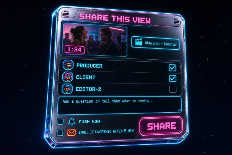
Stylized depiction of the Share This View dialog with a thumbnail, a 1:34 timecode badge, a clip title badge, a recipient list, and push + email checkboxes
3. The themed email — what your collaborator saw
If they didn't pick up the push within five minutes, the email landed.
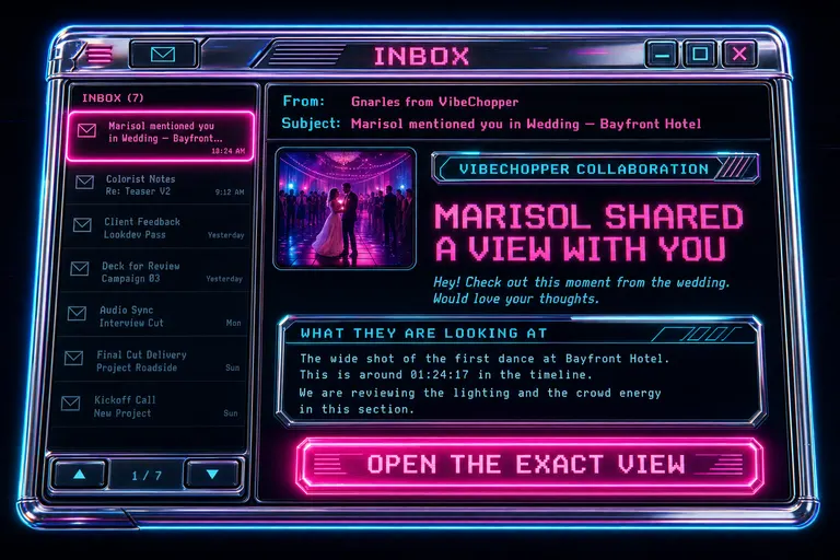
The "from" line read Gnarles from VibeChopper. Not a no-reply. A person, a coach, who showed up only when something needed looking at. The subject line was your name, the verb, the project: "Marisol mentioned you in Wedding — Bayfront Hotel."
The email was themed in the same palette as the editor — magenta accent, cyan rim, VHS-black background, chrome panels. When your client opened it, the room they walked into already looked like the room you wanted them to walk into next.
Inside the email, in order: an eyebrow reading "VibeChopper collaboration," a title — "Marisol shared a view with you," your note, the thumbnail, a panel titled What they are looking at with the AI-generated description, a single button reading Open the exact view, a metadata footer with project name and recipient name, and a closing line that read: "This link opens the project, timeline position, selected clip, and shared chat context inside VibeChopper."
That closing line was a contract. They knew before they clicked exactly what was about to happen. They weren't going to land on a generic dashboard. They were going to land where you stood when you wrote the note.
If the universal app was installed on whatever device they opened the email on — iPhone, iPad, Mac, Vision Pro — the link bounced them straight in. If not, they landed in the browser editor and the same restoration code ran. Same room. Same time. Same selected clip.
One template engine rendered every email VibeChopper ever sent you — sign-in codes, export-complete pings, share notifications, daily DATA Remediation reports — sharing one HTML shell and one text shell. The visual language was the same across every inbox arrival, so when one landed, you already knew it was the app. The build notes are in the themed email templates dev post.
Stylized themed VibeChopper email landed in a magenta retro inbox with a thumbnail, a 'What they are looking at' panel, and an 'Open the exact view' button
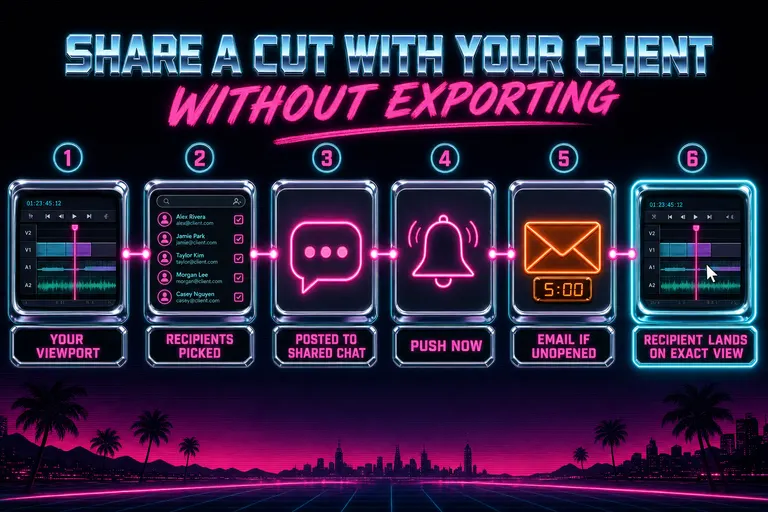
Diagram of the share flow: viewport captured → recipients picked → shared chat post → push now → email if unopened → deep-link reopens exact view
4. Threaded comments — talking back on the same view
The share didn't end at the email. The share opened a thread. Open the share dialog
Every share posted a card to the project's shared chat — a second chat tab in the editor, sitting next to the AI chat. The shared chat wasn't a list of system notifications. It was a real thread. Avatars, names, reply buttons. Every message lived inside the project, attached to view contexts, rendered in the same synthwave skin as the rest.
A share card looked like a regular message with an extra panel underneath. Thumbnail, timecode badge, clip name, one-line description, an Open view button. Hit the button and you opened the project at the same view the sender was on. A hundred shares stacked across a long project meant scrolling the thread and walking through them one at a time.
Replies were where the air went out of the "look at 1:34" loop. Your client opened the email, clicked Open the exact view, landed on the frame, switched to the shared chat tab, and typed back: "Yes. Hold the laugh longer. Maybe try a 0.4 second extend?" Their reply lived under your share card. You didn't have to copy a timecode anywhere. You didn't have to ask "what did you mean by 1:34." You jumped to the same view, made the change, maybe shared that view back at them.
One small detail: when you opened a share from a push or email, the message you clicked got highlighted in the thread with a soft cyan ring for the first second. After the fourth share in a long project, that highlight was the difference between "where was the note we were talking about" and "oh, there."
::
Stylized shared project chat thread with two message cards, one a Share card with a thumbnail and an Open view button, one a reply, both rendered in synthwave neon
6. The honest disclaimers
Two things to be straight about.
One: this only worked with people already shared on the project. The recipient list was the project's collaborator list. To add someone new, you added them as a collaborator first. Public review links live in a different threat model than collaborator notes — we didn't want a forwarded email leading to an open URL anyone could land on. The share carried weight because the recipient was named, signed in, and accountable. If you needed to see why an AI move happened on a share, the tool-trace cards lived in the same project view your collaborator landed on.
Two: it didn't replace the final delivery. If your client said "yes, ship it," you still had to hand them an MP4 they could put on Instagram. That's what Export was for — MP4, MOV, WebM, FCPXML, EDL.
The share dialog ate the review cycle — the round-and-round of "look at 1:34, no I meant 1:24." That's the cycle that turned a one-day project into a one-week project. Export happened once, at the end, when everyone agreed. The middle of the project — the thinking — happened in the room. Same room. Same playhead.
7. The cut that never left the app
An export is a snapshot. You burn one in, you ship it, and the moment your client comes back with a note, that snapshot is stale. So you re-render. So it's stale again twelve minutes later. Every cycle is a small expensive lie about where the cut actually is.
A deep link is the opposite. It's a pointer. Whatever you do to the timeline between sending and opening, they see the latest. If they bookmarked the share email and clicked three days later, they'd land on the current project, not a frozen render. The pointer survived your edits.
The small shift: editing software for twenty years treated the export as the product. It wasn't. The export was the receipt. The product was always the thinking — "hold the laugh longer," "swap that B-roll," "this needs to breathe." The share dialog put the thinking inside the room where the cut actually lived.
Your client's note arrived attached to the frame it was about. Your reply landed on the same frame. The frame, meanwhile, kept being part of a live project. Notes and cut were the same artifact, not two artifacts you had to keep syncing.
Burnout's not a character flaw. It's a tool problem. One of the heaviest tools in the pile was the export-and-link review cycle. We took it out of the box.
Next rep: open a project, scrub to a moment you're not sure about, press share, type one sentence, send it to one person, put the laptop down for the afternoon. Let the room do the carrying. Sleep when the reply comes back.
See you on the timeline.
— Gnarles
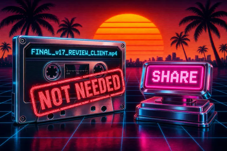
A chrome export cassette with a big red 'NOT NEEDED' stamp across it, palm trees and a sunset behind, a glowing share button to the right
Try the workflow
Open every feature from this post in the editor
These panels collect the features discussed above. Sign in once, finish your profile if needed, then the editor opens the first highlighted surface and walks through the tutorial.
Step 1
Share this cut with a teammate
Send your exact viewport — time, clip, panel state — to anyone already shared on the project. No render.
Share this cut with a teammate →Step 2
Open the share dialog
Pick recipients, write a note, decide whether to push now and whether to email if they do not open it.
Open the share dialog →